
The problems with luxury fashion typeface rebranding
Once in a while, companies rebrand their well-known logo to accommodate market trend in effort to stay relevant. Some brands like Nike went as far as changing its original name. Rebranding is a common practice and it usually indicates a new direction of a company.
Image: Burberry logo
Five months after his appointment as the chief creative officer of Burberry in 2018, Riccardo Tisci unveiled Burberry’s new monogram and typeface designed by art legend Peter Saville.
For Tisci, the rebrand marked a new era; one that parts away from Burberry’s previous creative director for 17 years, Christopher Bailey. For Diet Prada and a lot of people, the new logo design of interlocking T’s and B’s reminds them of a soft pretzel.
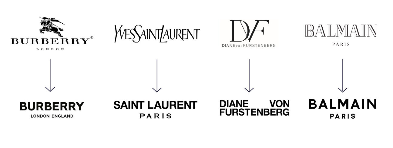
Joining Burberry, the latest round of rebranding among luxury fashion brands causes more uproar and internet debacle than usual. Reason being, the revamped typeface looked too similar from one brand to another. All of them had used the same type of fonts. We call it sans-serif in typography.
In general, there are two types of fonts, serif and sans-serif. Serif is the extending feature or tail at the end of strokes. Another key takeaway from serif fonts is the contrast between thick and thin strokes. One of the frequently used serif fonts is Times New Roman.
In contrast to serif, there is no thick/thin transition in the body of sans-serif fonts. The letters are formed equally and there is no tail at the end of the strokes. Some of popular sans-serif typeface are Helvetica, Arial, Futura and Gill Sans.
Serif radiates a classic, elegant look while sans-serif is touted as the minimalistic and modern type of fonts. Sans-serif gained popularity in the 19th century for its clarity at distance in advertising.
Serif, on the other hand, is suitable for body text. The contrast between thin and thick lines makes it pleasing to the eye. Publications we consume daily from newspaper, magazines and books to most websites use serif fonts for body copy.
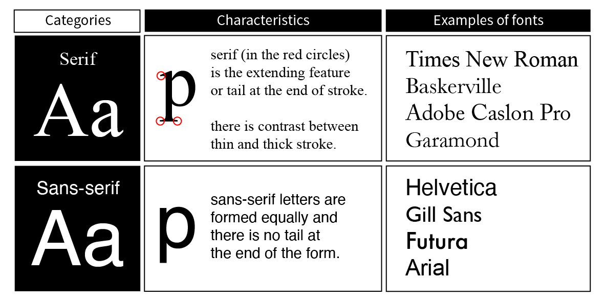
Image: Serif and sans-serif are the categories of fonts, not the name of the fonts.
What’s the problem with luxury brands rebranding?
The existence of luxury fashion brands is very much attached to their hundred-year-old culture and heritage. Even though it is a different time now, luxury brands are still using their founder’s story, culture and heritage to sell the brand.
The longer a luxury brand has been established, the more stories it can sell - Louis Vuitton and Hermés on how they started with horse riding staples, Chanel on how Coco Chanel defied rules in dressing or Mark Cross on being American oldest luxury brand.
Then, let’s take the CC monogram on Chanel bag for instance. To this day, the brand capitalises on its founder, Coco Chanel. Their infamous no. 5 perfume is marketed as Coco Chanel’s favourite scent. There’s Gabrielle bag, original name of Coco Chanel.
That fact alone is valid enough to back-up the argument behind the debacle of why it’s such a big deal when luxury brands unveiled their sans-serif fonts that bear resemblance to one another. As if they are not homogenous enough, all of them are in black and white.
The imprint of the heritage and original founder shouldn’t be eliminated from the brand’s typeface if the brand continues to capitalise on the heritage and founder’s story.
Furthermore, there’s another problem pointed out by John Whelan on Business of Fashion. Homogeneity is dangerous for a global creativity industry. He also made an interesting point of Burberry’s rebranding.
“Perhaps the most awkward example is Peter Saville’s rebranding of Burberry. ‘London England’ is retained, thereby seeking to retain the positive brand associations of that city and country, yet all local flavour has been erased.”
Does that mean sans-serif is not the right choice for luxury brands?
Applying sans-serif font into a brand rich in heritage is tricky, but that doesn’t mean it cannot be executed. Rimowa and Gucci, for example, nail their rebranding and successfully implement sans-serif fonts.
The trickiest part about designing typeface lies in the details. Designer has to be meticulous with the size, shape, height and thickness of the letters, including spacing between letters or kerning.
Take letter ‘O’ for instance. The letter ‘O’ in some fonts is rounded, while some are more elliptical.
The letter ‘O’ in Louis Vuitton adopts the rounded shape. Louis Vuitton bags with elliptical letter ‘O’ are definitely counterfeit.

Typography is a big part in branding.It doesn’t take a graphic designer to know whether a typeface is a right fit for a brand or not. Anyone can sense that. Branding is a perception. It exists in the head.
The typeface should also be in line with the art direction of collection and accessories. It’s worth noting that the dominance of sans-serif is due in part to the surge of casual wear.
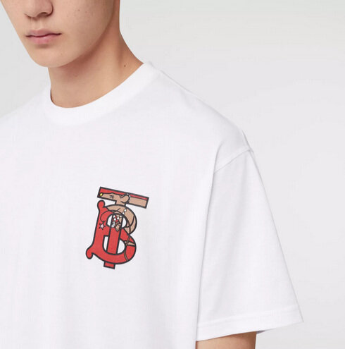
A lot of rebranding efforts from luxury brands are followed by the launch of casual wear. Burberry launched t-shirts with the ‘TB’ monogram pattern shortly after unveiling its new monogram.
Dior went through subtle rebranding when Maria Grazia Chiuri took the creative director role in 2016. Her debut collection featured feminist t-shirts and more casual outfits.
Adapting to market demands is necessary to maintain relevance. However, that doesn’t mean brands should compromise their culture and heritage to follow the hype.